The Power of Comparative Analysis
A major feature of stereotic.com is the easy and efficient comparison of financial assets (crypto, to begin with), amplifying the capabilities of usual (technical and fundamental) analysis methods.
“Comparative analysis” is the approach of focusing on the comparison of investment alternatives, rather than analyzing them individually. Comparative analysis is enabled by efficient novel techniques: integrated, columnar visualization layout, many-chart simultaneous measurements and drawing, perceptually uniform colors, ranking and filtering.
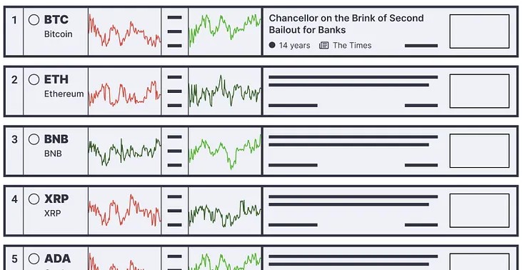
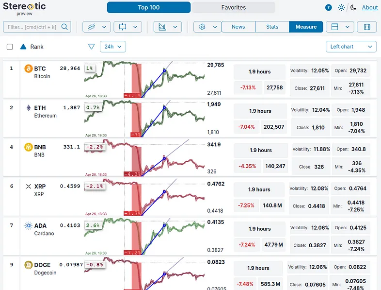
The preview of the Stereotic Explore app already implements comparative analysis techniques. It is a structured, ordered and interactive list of crypto assets, with rows containing charts, news, statistics and measurements of a given token:

It is similar to a web search results page (which we cannot live without), or feature comparison tables (which we use to find a proper TV set or a coin listing service). Or, similar to a fancy spreadsheet (which we always use to order and survey items and their data). Concise, filtered and ranked — aimed at comparison of our investment alternatives.
What makes the comparative approach complete and the Stereotic app unique, is the set of operations enabling the analysis of all rows simultaneously:
- measure time ranges: how do prices change relative to each other the same time?
- draw trend lines and various technical analysis patterns: do they share properties, are there unique patterns?
- display statistics, coin metrics, social network data, indicators: how do assets perform fundamentally?
- sort and rank according to any derived value: which assets have the least volatility, largest rate of change on a time range etc.?
- filter on specific assets: how our ideas, stories, interpretations perform — handled as separate lists of assets?
Just click one of the charts to measure or draw — all will be updated at the same time point where we clicked. To change the drawing and power tools, just use the selectors in the header. Ranking is also easy, just click on the relevant values, while filtering works by selecting the rows, and adding to named lists.
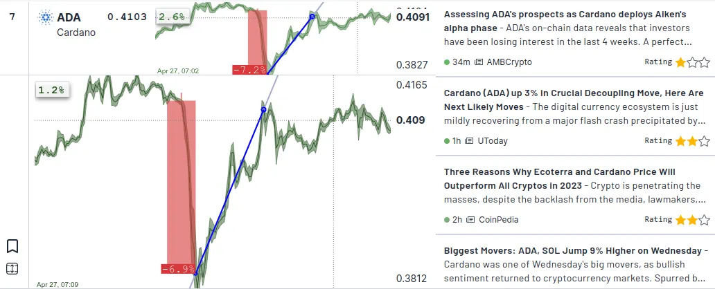
As an example, there was a sudden general drop the last 24 hours in crypto prices (for the reasons we can check the AI-curated “News” section). Below 1.9 hours is measured on the charts (red rectangles, 4-7% fall), along with a trend line fit for the rebound. ADA seems to be outperforming the others, and while the decrease in the BNB price was much smaller, it wasn’t able to climb back to positive regions:

We can rank the assets using the measured values, create lists for our different stories, ideas, or dig in the latest and most important news or statistics.

There are several tools and data sources available or under development at Stereotic boosting the efficiency of the comparison. These features do not replace, but expand the capabilities of the traditional technical and fundamental analysis tools, which are still available.
A prominent example of such a comparison technique is the use of perceptually uniform colors. All percentages displayed are colored according to the common red-green scheme. However, as two colors cannot really describe the percentage range we are working with (e.g. -0.1% would be the same red as -10%), we use a continuous color palette. We can perceive how similar the different shades are — and we will perceive the same as the percentages would tell us, making comparison fast and obvious.


